PROJECT OVERVIEW
Aux Ciels Ouverts is a wellness center located in the south of France, specializing in traditional Chinese medicine.
The practitioner offers various techniques from this approach, including Tui Na massage, acupuncture, and Chinese herbal medicine, to guide patients toward overall well-being.
Traditional Chinese medicine aims to address suffering at its root rather than focusing solely on symptoms. The goal is to remove layers of pain by restoring the flow of Qi (pronounced “Chi”), the body’s vital energy. This process helps relieve physiological and psychological dysfunctions while reconnecting the person to something pure and infinite — like open skies — while remaining grounded in reality.
The long-term vision of the project includes working within healthcare institutions, particularly supporting women who have experienced violence (domestic or illness-related, such as cancer).
Graphic Intentions
I was commissioned to create the complete visual identity and art direction for the center’s launch.
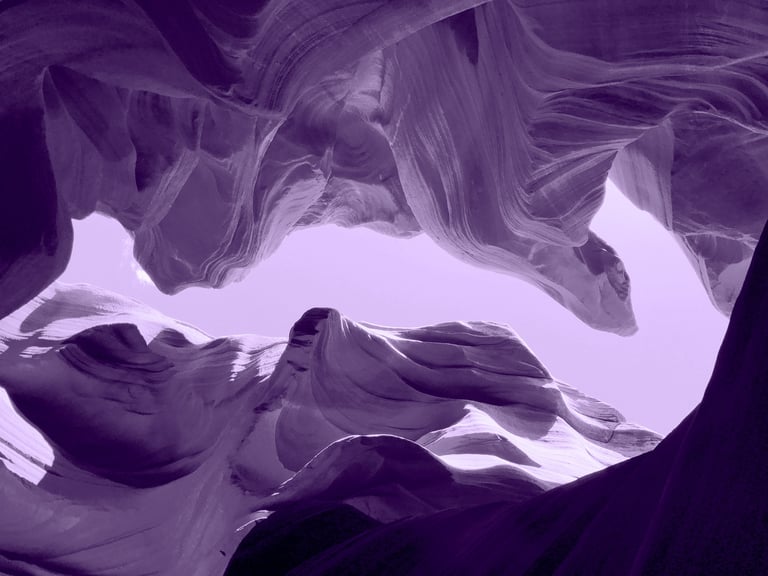
The visual universe needed to evoke something mystical, harmonious, airy, and free — like the sky or the sensations experienced during treatments — while remaining professional and grounded. Since the project aims to integrate into public structures, it was important to avoid an overly “bohemian” or “esoteric” aesthetic to keep all doors open.
Deliverables included:
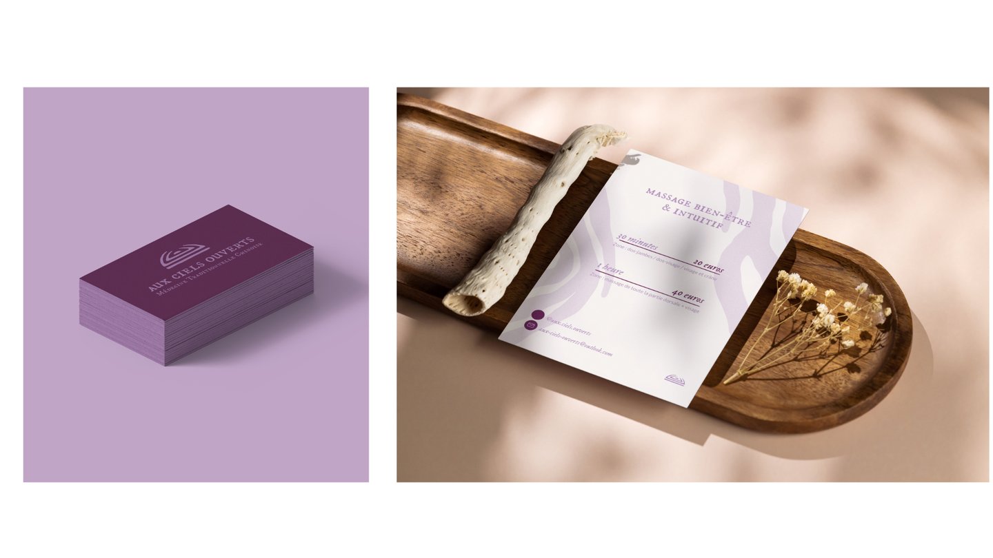
A complete visual identity (logo, variations, color palette, typography)
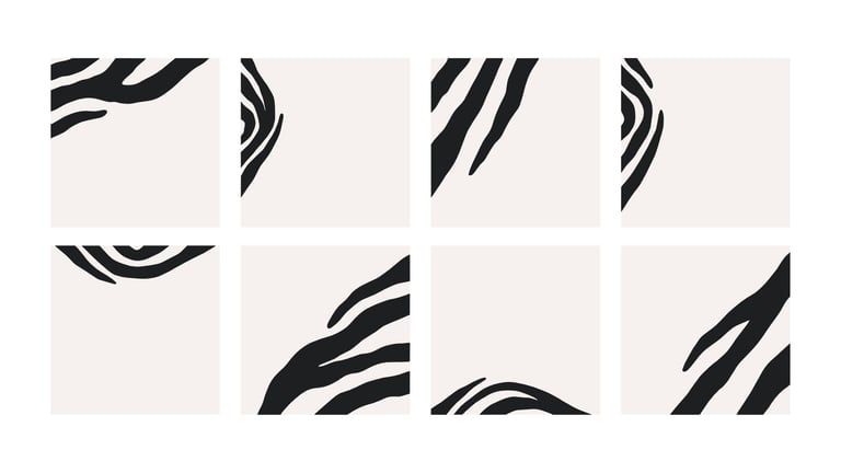
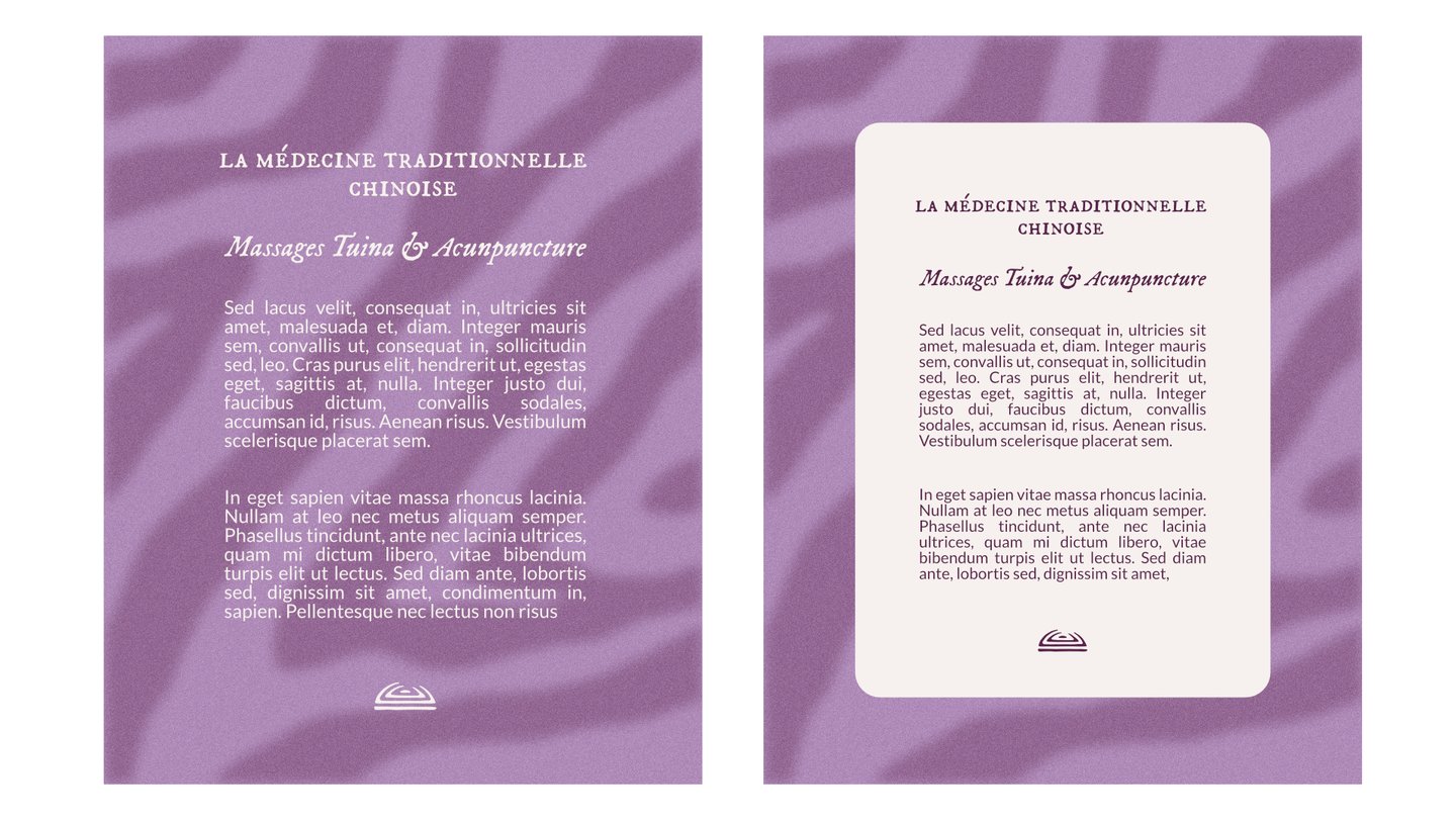
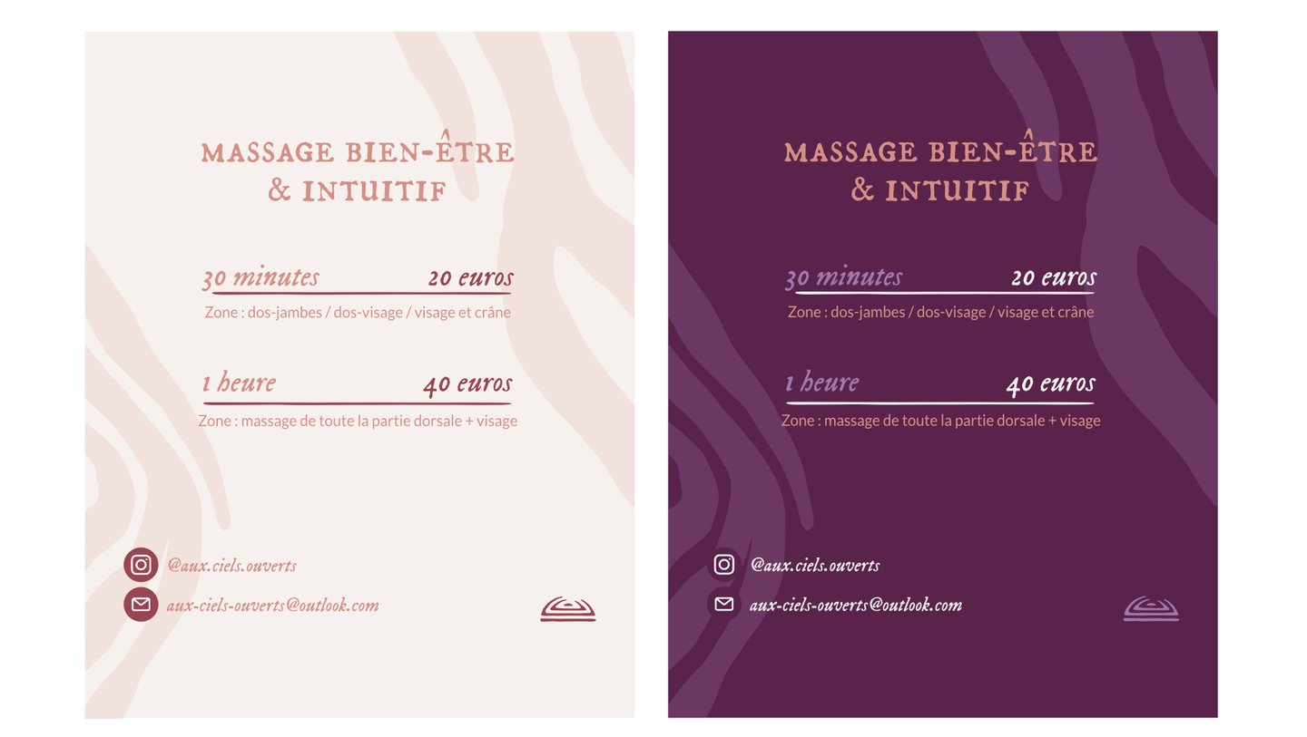
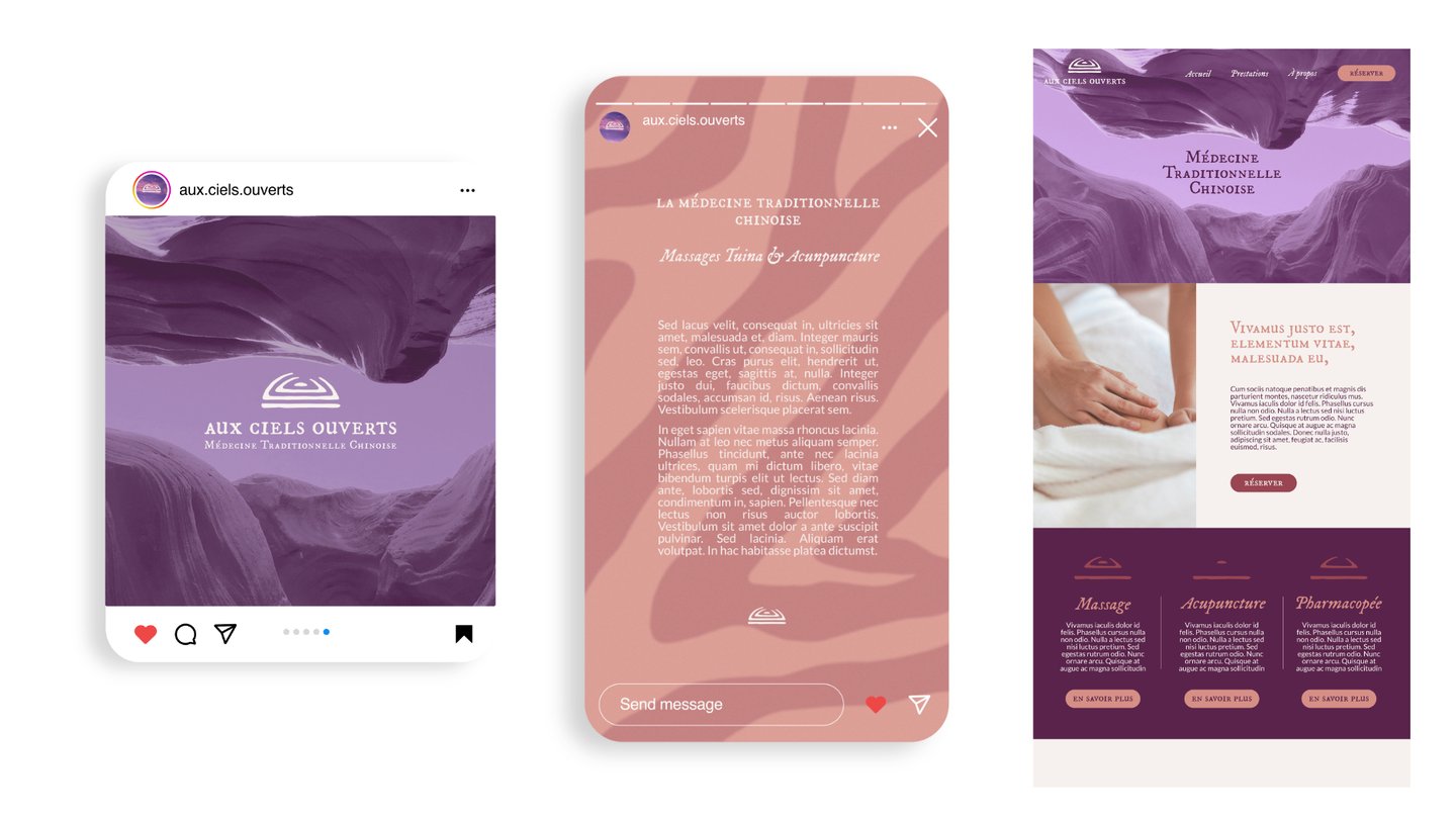
Visual content for social media (templates, photos, textures, etc.)
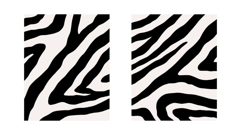
Graphic elements that allow the practitioner to create her own materials (patterns, textures, layout elements)
Creative Approach
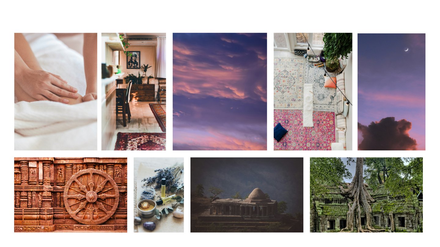
I built upon the clinic’s existing communication materials to structure and bring coherence to the new identity while respecting the initial atmosphere.
The goal was also to provide a simple, natural visual system that the client could easily use and evolve over time.
I identified her visual inspirations around well-being, tradition, warmth, and cultural richness, which were integrated into the new identity. She also expressed a preference for the color purple, which was perfect: a calming hue associated with spirituality, wisdom, and inner peace.
Full visual Identity
Therapists and medical practices
LOGO CONCEPT
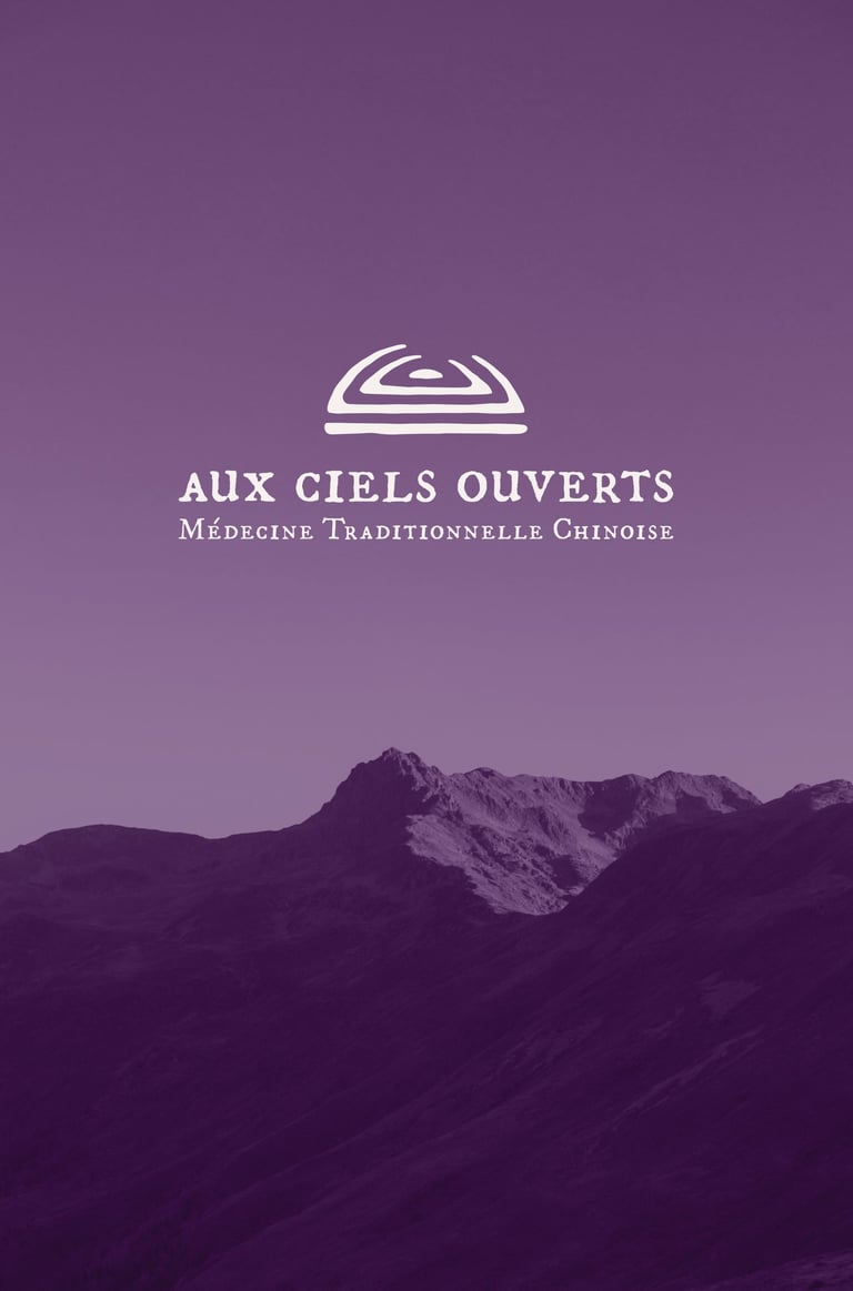
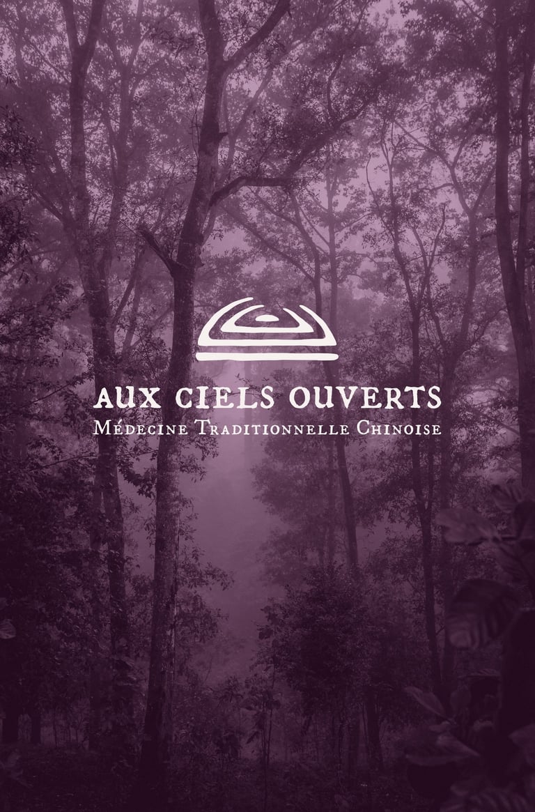
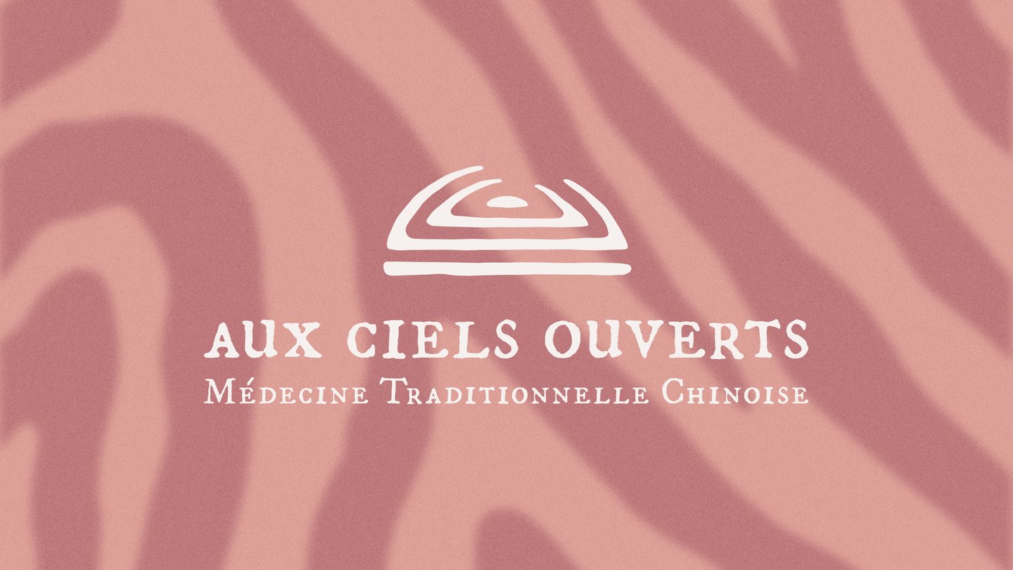
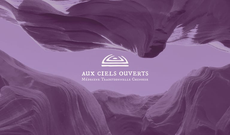
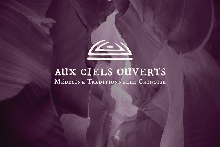
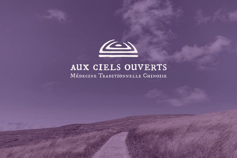
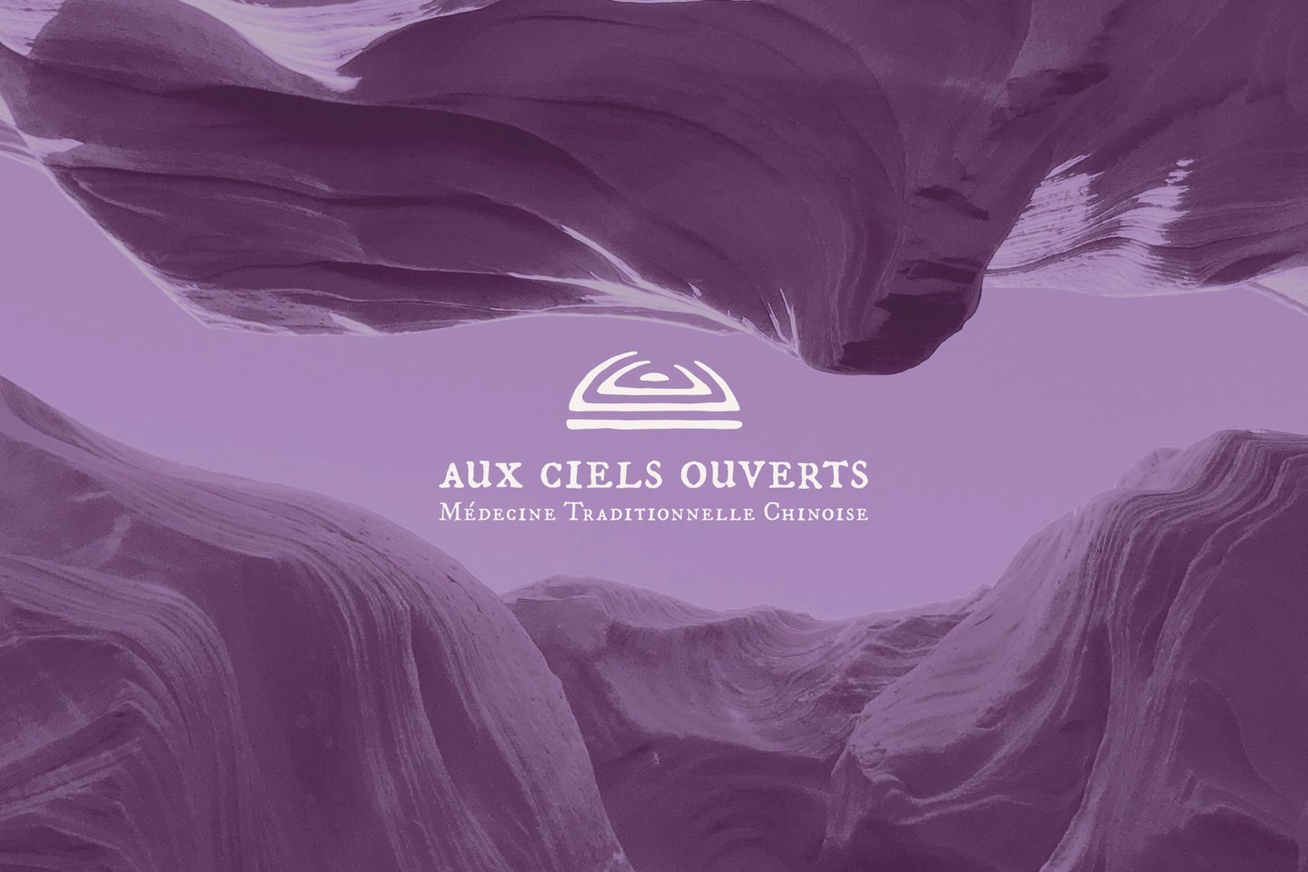
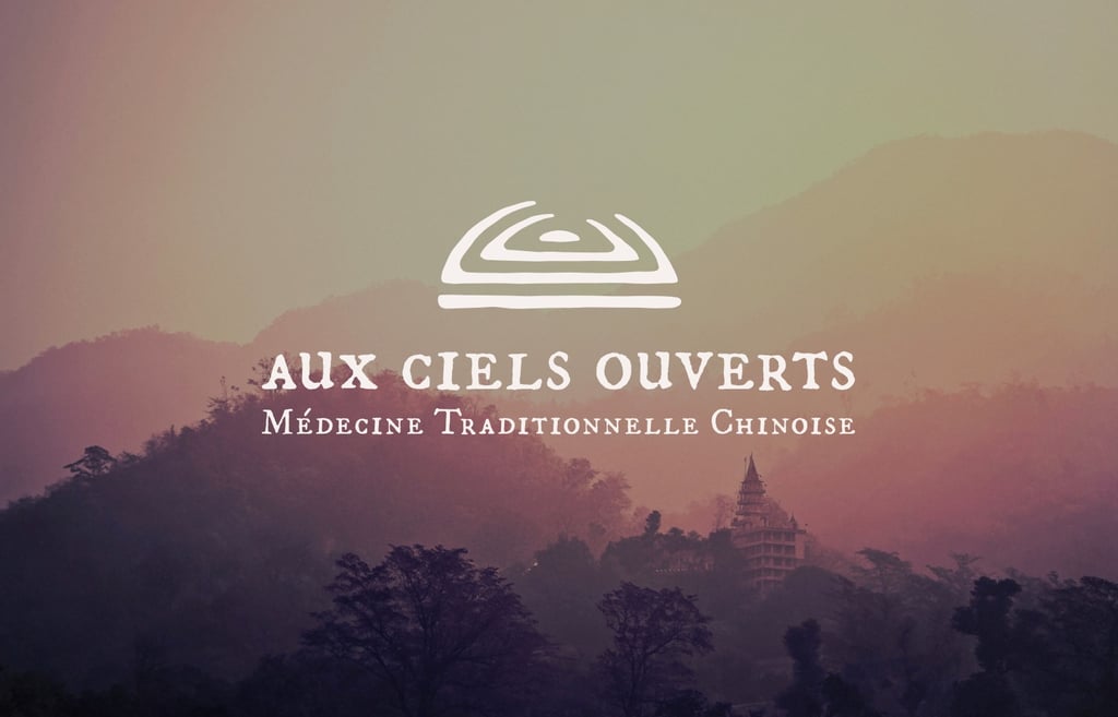
For the logo, I wanted to visually express the central idea behind the name: “Open Skies” — and reveal its deeper meaning.
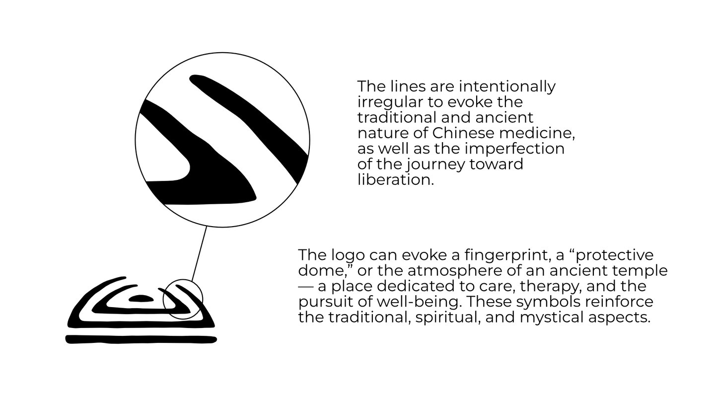
I drew inspiration from traditional Chinese seals, which carry strong cultural and historical resonance, nodding to the roots of the practice. Their aged, stamped appearance evokes something human, wise, and anchored in time — like a legacy passed down through generations. They also reminded me of fingerprints: unique, personal, and symbolic of human touch, directly linking to the massage techniques practiced by the therapist.
I chose to give the logo an imperfect, textured look to evoke something both ancient and handmade, while also reflecting the healing journey, with its imperfections and gradual evolution.
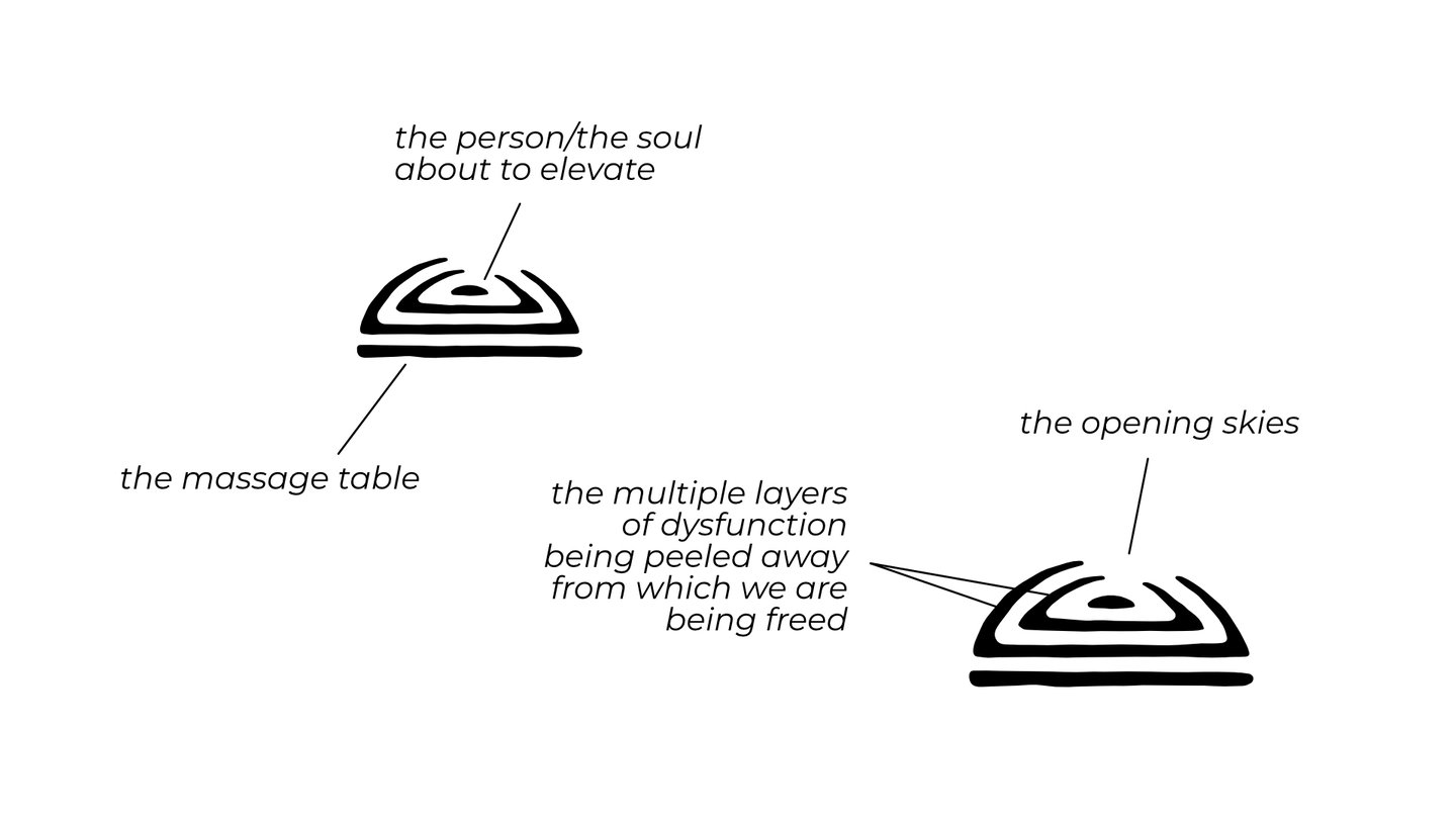
Visually, the logo carries multiple layers of symbolic meaning:
The bottom line represents the practitioner’s table, while also acting as a grounded and stable base.
The central dot symbolizes both the person (or soul) on the verge of release and the root of the suffering to be addressed.
The two curved lines surrounding the dot represent the layers of dysfunction being untangled — literally illustrating the opening of the skies.
Together, the elements form a dome, suggesting protection — like a sanctuary of care — while subtly evoking the atmosphere of an ancient temple.

COLOR PALETTE
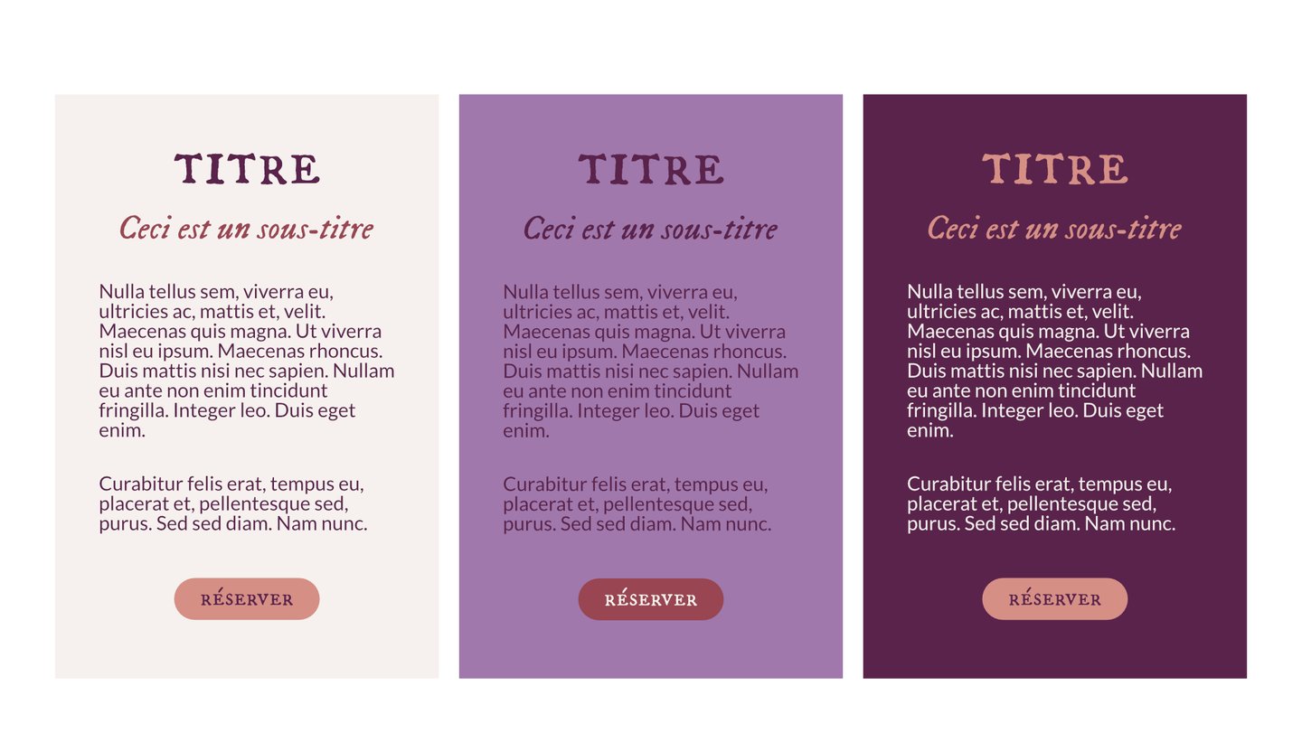
Purple: Often associated with spirituality, creativity, wisdom, nobility, dignity, inspiration, meditation, and inner peace. Purple is also considered a calming color that can help soothe the mind and reduce stress. The darker shade is used as a complementary color to add contrast and can be applied to most text.
Rust: Symbolizes decay, the passage of time, and resilience. This brown-based red can evoke feelings of grounding, age, and wisdom.
Off-white: Highlights the other colors and pairs well with each of them. It is used to fill large empty spaces and helps text stand out when placed on darker backgrounds.
