PROJECT DESCRIPTION
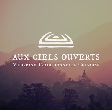
Aux ciels ouverts (which loosely translates to “Under Open Skies”) is a healing space located in the south of France, specializing in traditional Chinese medicine.
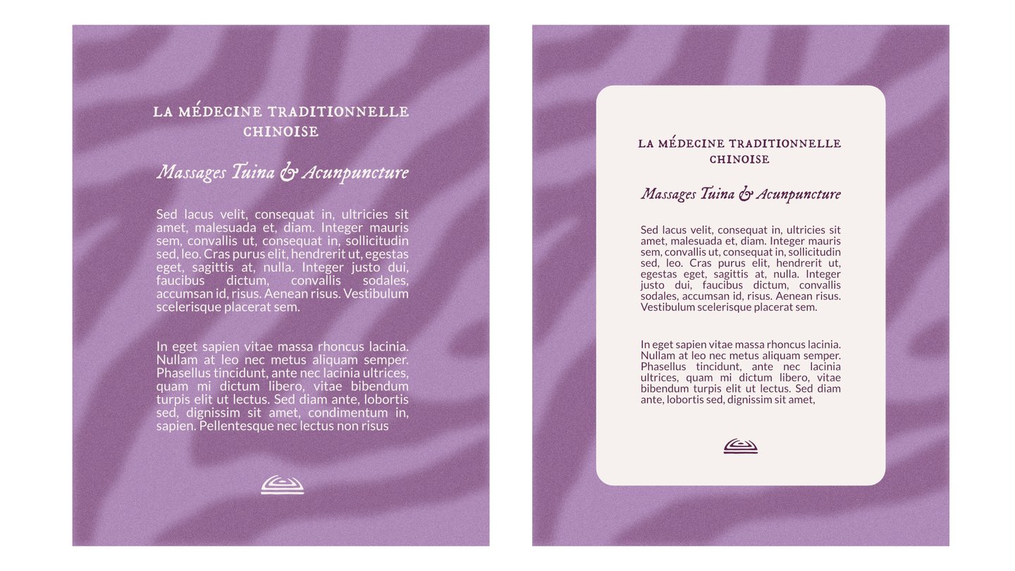
The therapist uses several techniques from this practice — including Tui Na massage, acupuncture, and Chinese herbal medicine — to support their patients' well-being.
Traditional Chinese medicine seeks to treat suffering at its root rather than simply addressing symptoms.
The aim is to peel back the layers of pain by restoring the circulation of Qi (pronounced “Chi”), the body’s vital energy. This process helps relieve both physiological and psychological dysfunctions, allowing the individual to reconnect with something pure and limitless — like the open skies — while remaining grounded.
The long-term vision is to eventually work within hospitals, particularly to support women affected by violence (such as domestic abuse or illness-related trauma, like cancer).
Design Intentions :
I was asked to create a full visual identity and artistic direction for the practice’s opening.
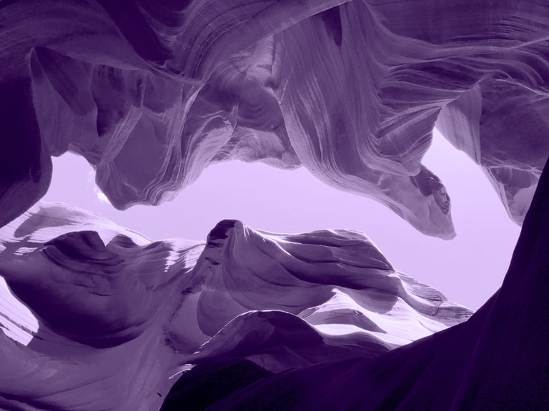
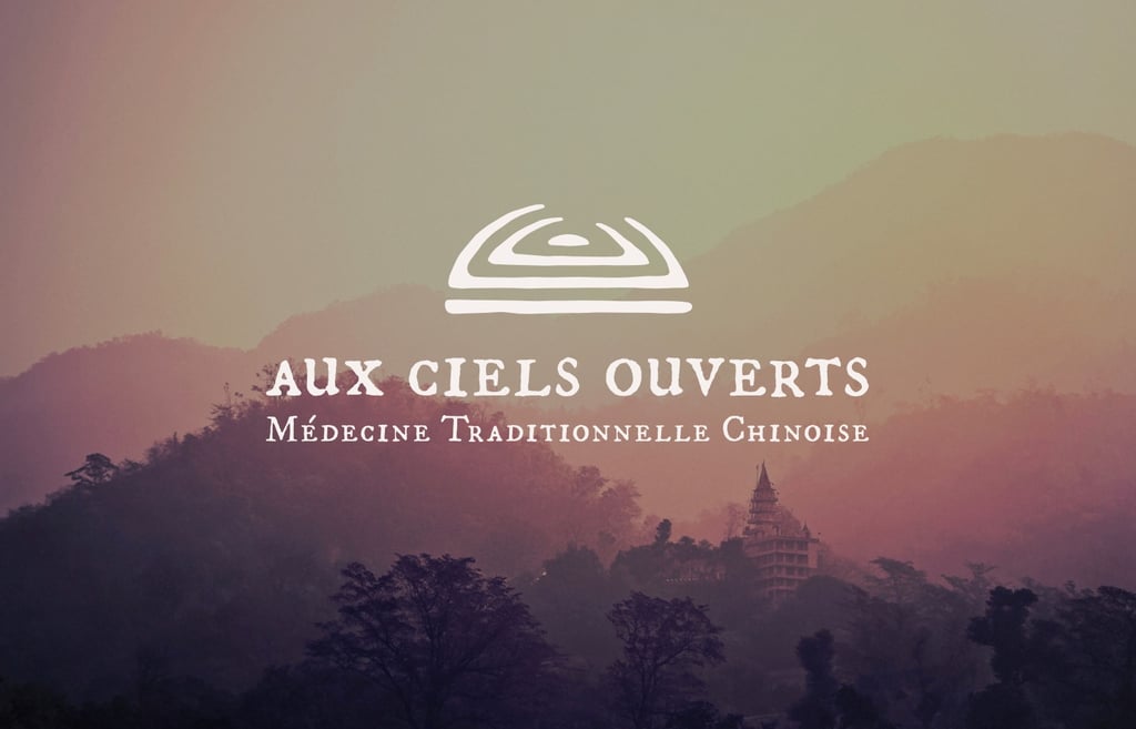
The concept needed to reflect something mystical, harmonious, airy, and free — evoking the sky and the sensations experienced during treatment — while still feeling genuinely grounded and professional. Since the project carries ambitions to integrate into public institutions, we had to avoid an overly “boho” or “quirky” aesthetic, so as not to close any doors for the practice in the future.
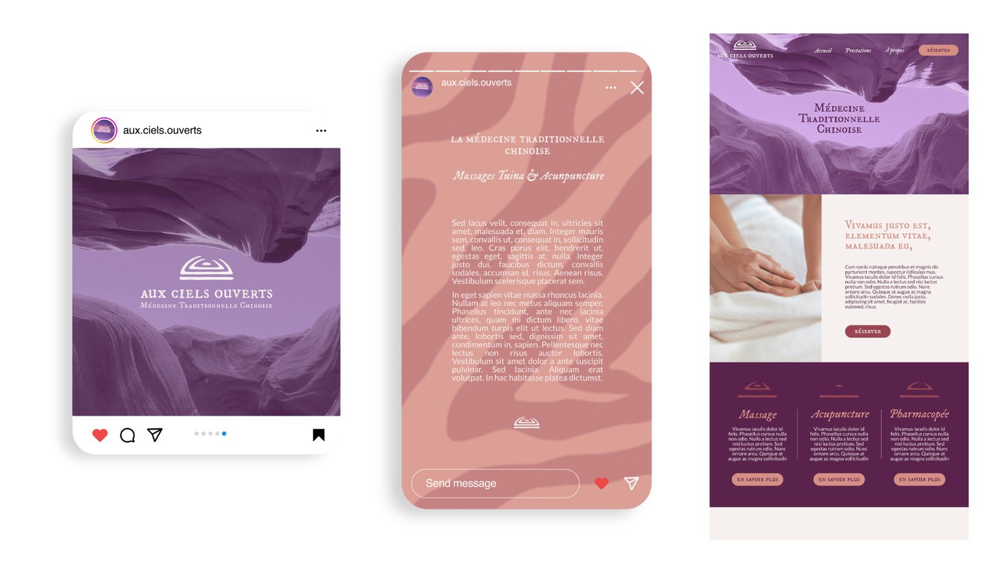
The deliverables included :
- A full visual identity (logo, variations, color palette, typography)
- Social media templates and visual content (textures, photos, etc.)
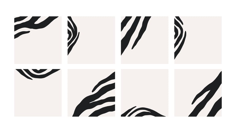
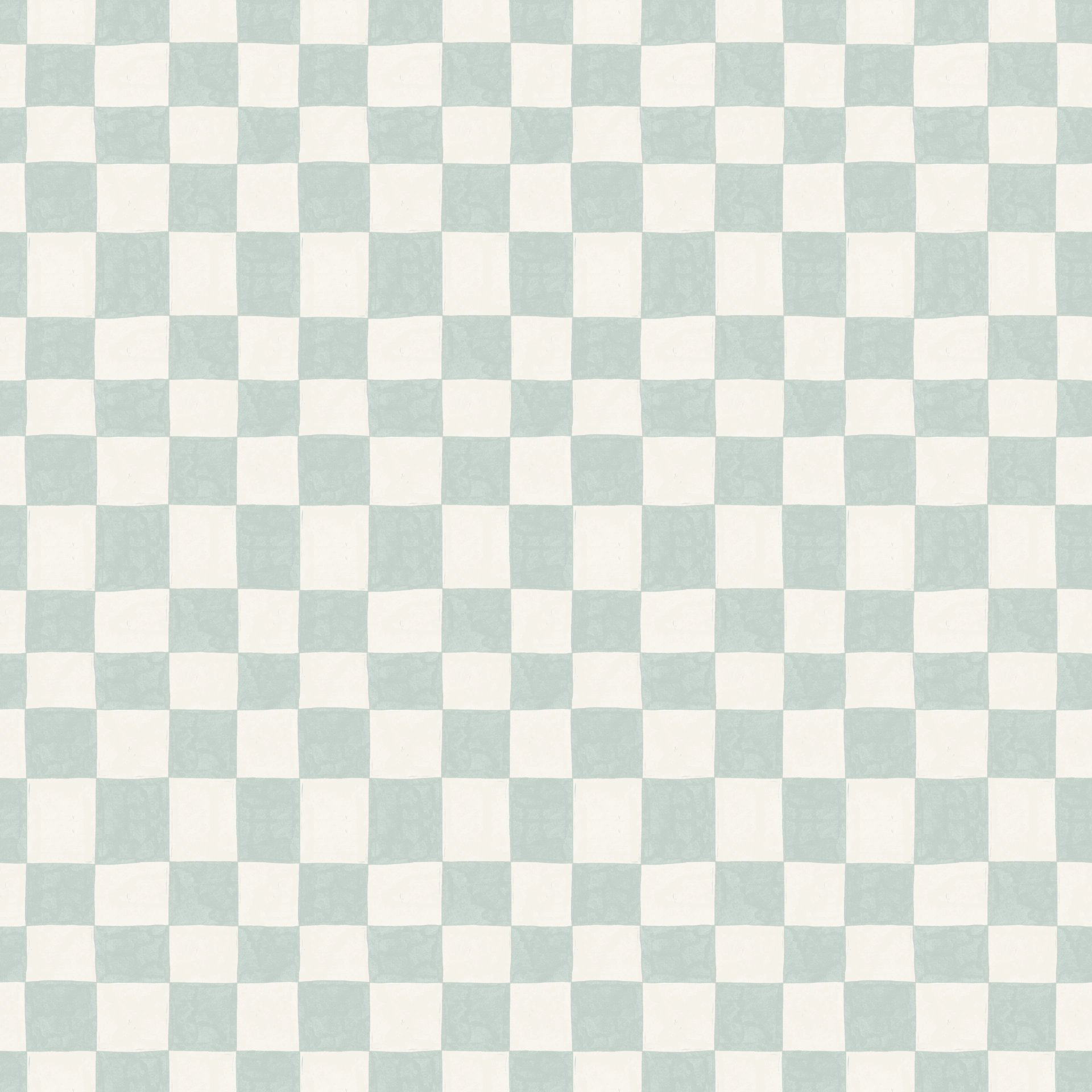
- Graphic assets to help the therapist create their own materials (patterns, textures, and layout elements)
Creative Approach :
I based the design on the practice’s existing communication materials, aiming to bring more structure and coherence while preserving the original mood.
I also wanted the final result to feel natural and intuitive for the client, making it easier for them to maintain visual consistency over time.
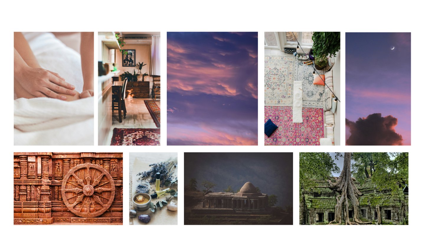
My client was clearly drawn to visuals evoking well-being, tradition, warmth, and cultural richness — elements I could fully integrate into the new identity.
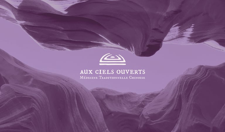
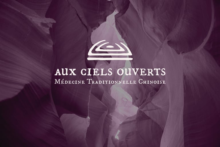
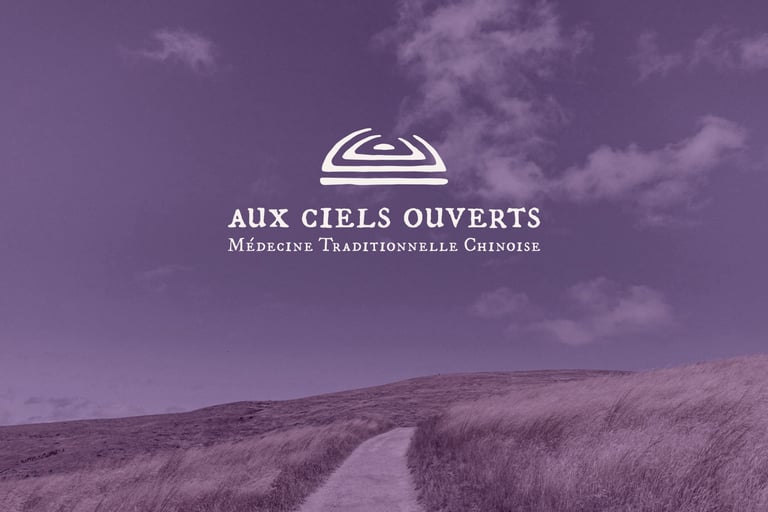
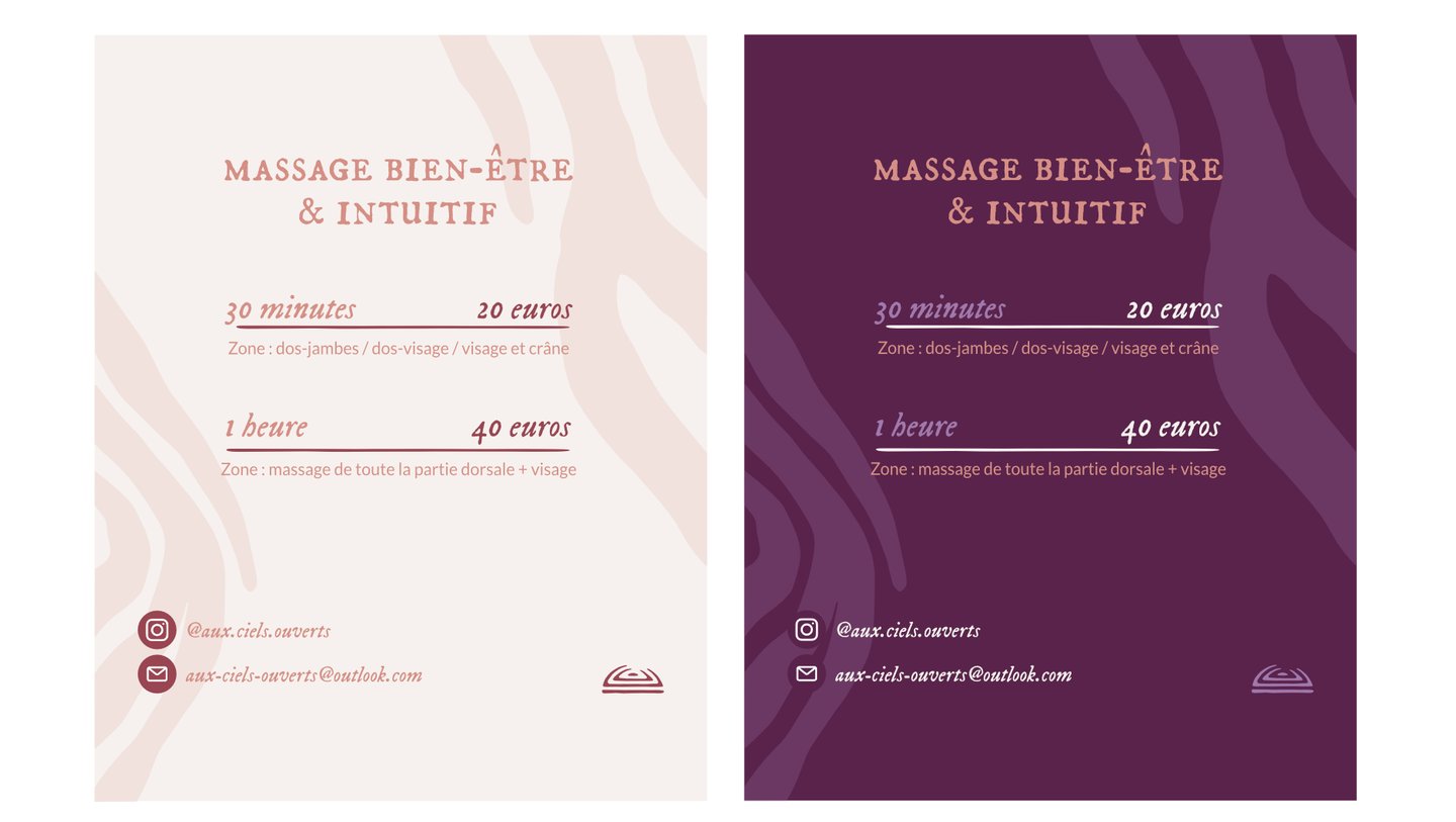
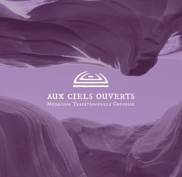
They also mentioned an affinity for the color purple, which worked perfectly: it’s a calming, spiritual hue that symbolizes inner peace and wisdom.
Full Visual Identity
Therapists & Healthcare Practices
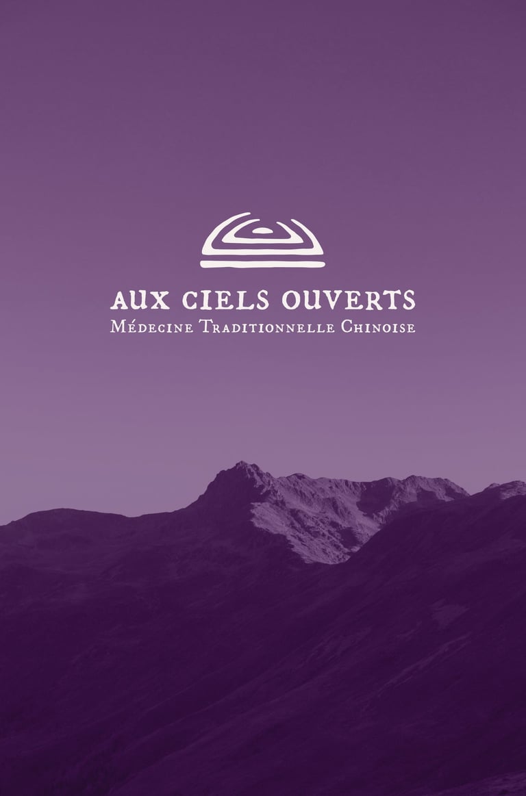
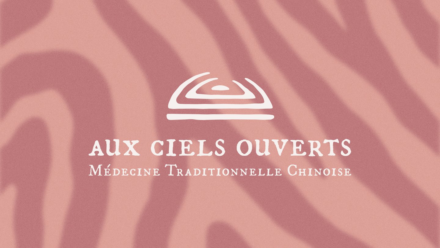
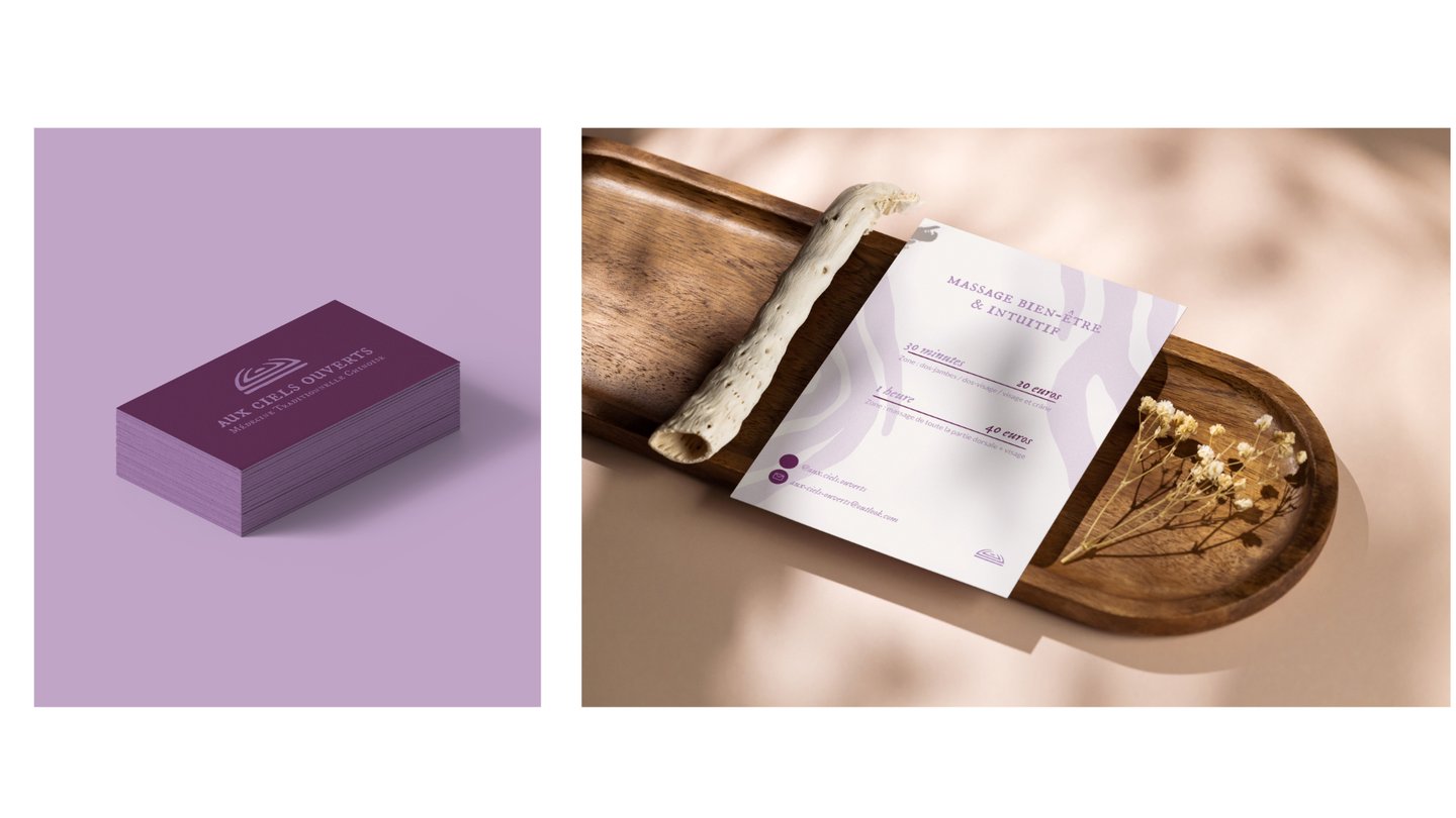
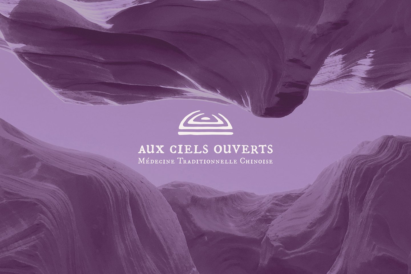
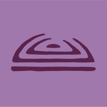
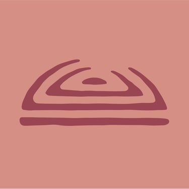
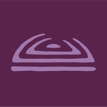
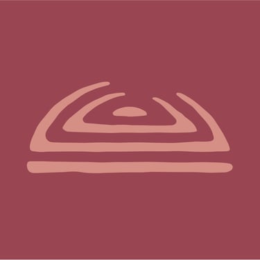
LOGO CONCEPT
For the logo, I wanted to visually express the core idea behind the name: the open skies — and reveal its deeper meaning.
I drew inspiration from traditional Chinese seals. They carry a strong cultural and historical resonance, as a nod to the cultural origins of the practice. Their aged, stamped look suggests something human, wise, and ancestral — like a heritage passed down. They also reminded me of fingerprints: unique, personal, and symbolic of human touch — a reference to the massage techniques used by the practitioner.
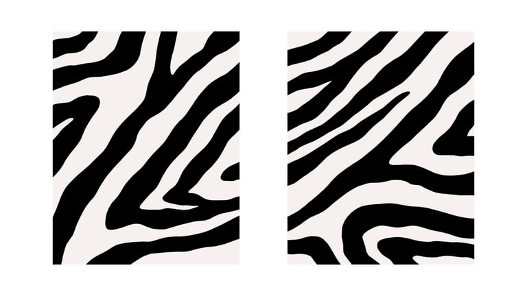
I chose to give the logo an imperfect, textured appearance to evoke the idea of something both ancient and handmade — but also to reflect the imperfect and evolving journey of healing.
Visually, the logo carries symbolic layers:
- The line at the bottom evokes the practitioner’s table, but also acts as a grounding foundation.
- The dot at the center represents both the person (or soul) about to be released, and the root of the suffering being treated.
- The two curved lines around the dot symbolize the layers of dysfunction being peeled away — and at the same time, they literally illustrate the skies opening.
The overall dome shape suggests protection, like a healing sanctuary — and also subtly evokes the athmosphere of an ancient temple.
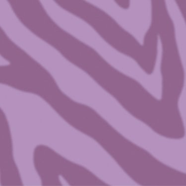
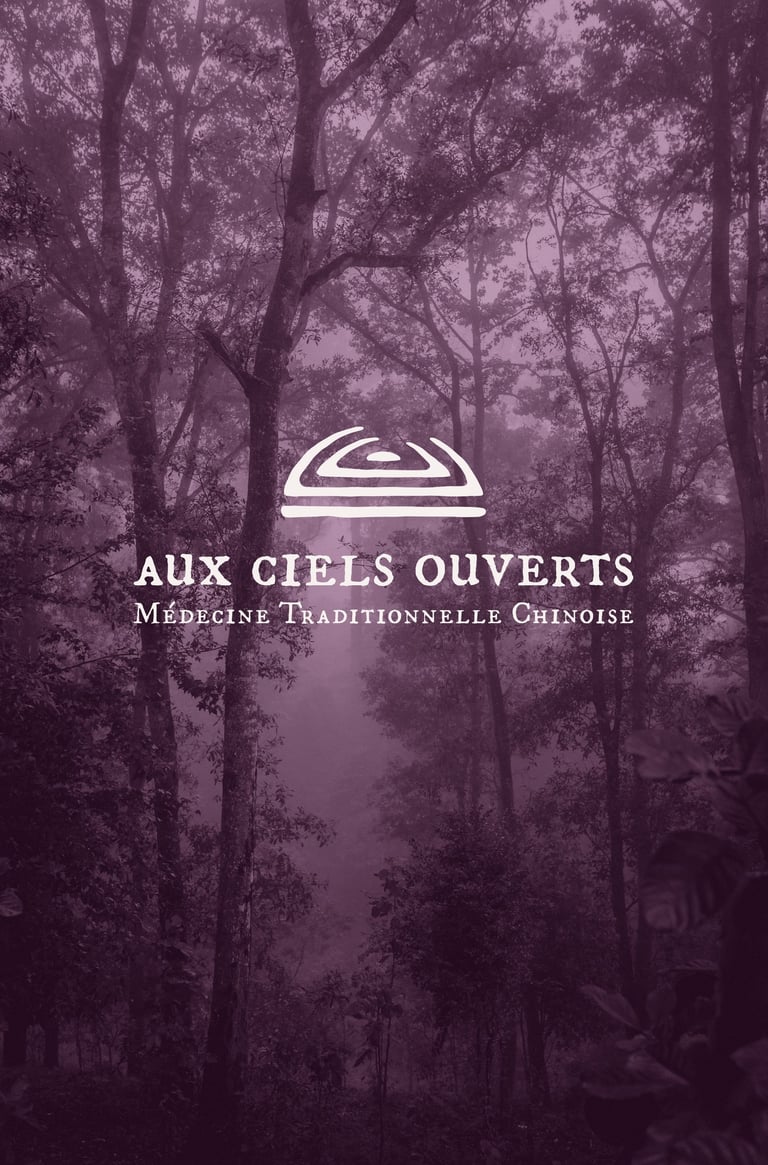
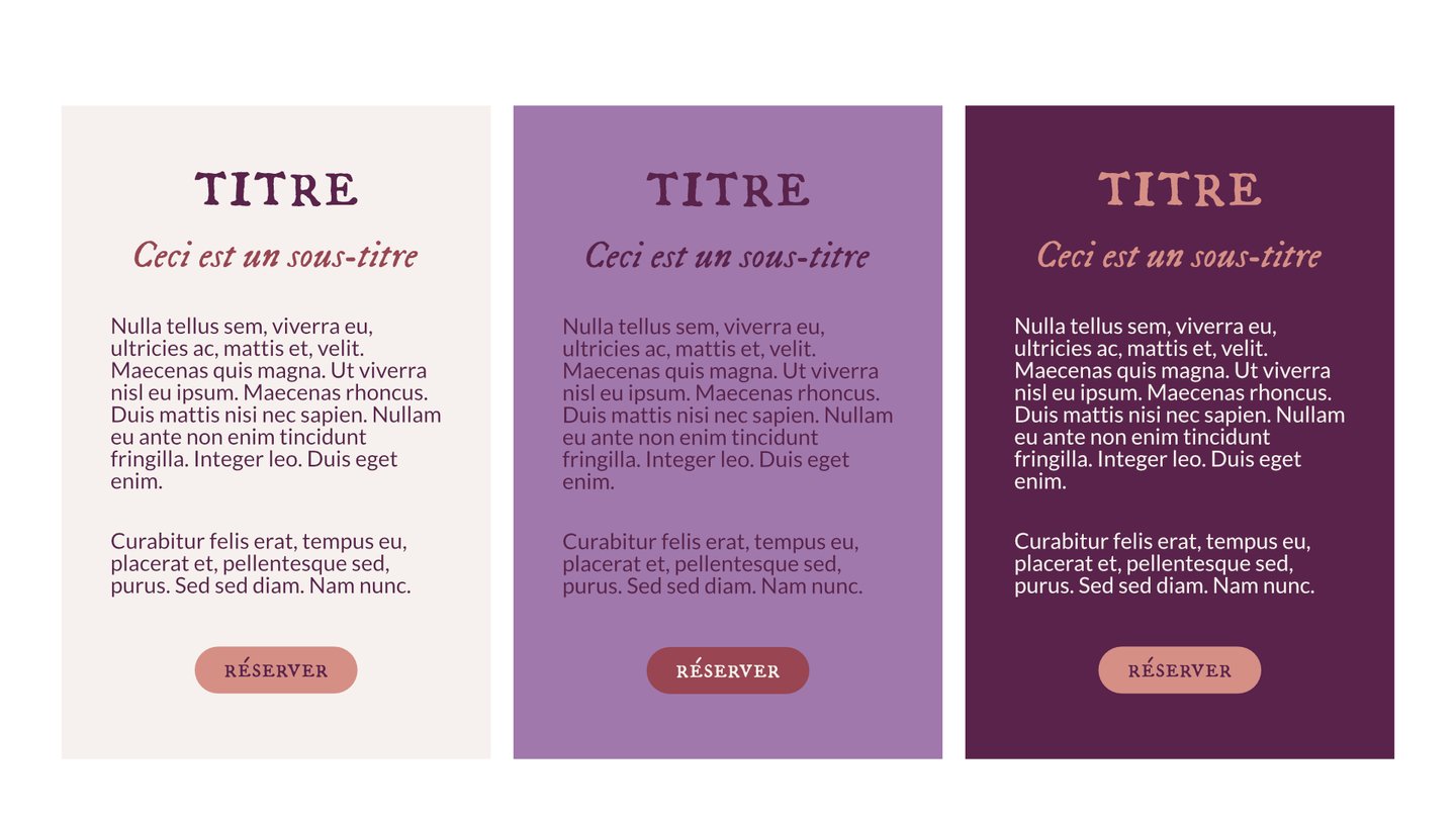
COLOR PALETTE
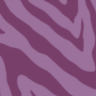
Purple : It is often associated with spirituality, creativity, wisdom, nobility, dignity, inspiration, meditation, and inner peace.
Purple is also considered a soothing color that can help calm the mind and reduce stress.
The darker shade is used as a complement to add contrast. It can be applied to most of the text.
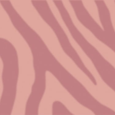
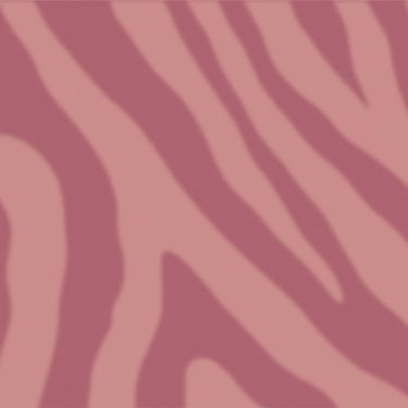
Rust : It symbolizes decay, the passage of time, and resilience.
This brown-based red can evoke feelings of grounding, age, and wisdom.
Off-white : It flatters the other colors and pairs perfectly with each of them.
It is used to fill large empty spaces and helps text stand out when placed on dark backgrounds.