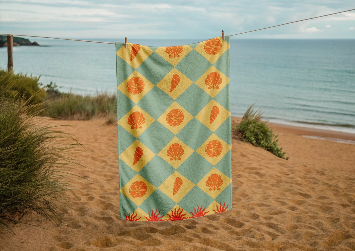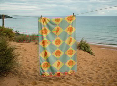
Beach towel design
Custom illustrations for a bath linen brand
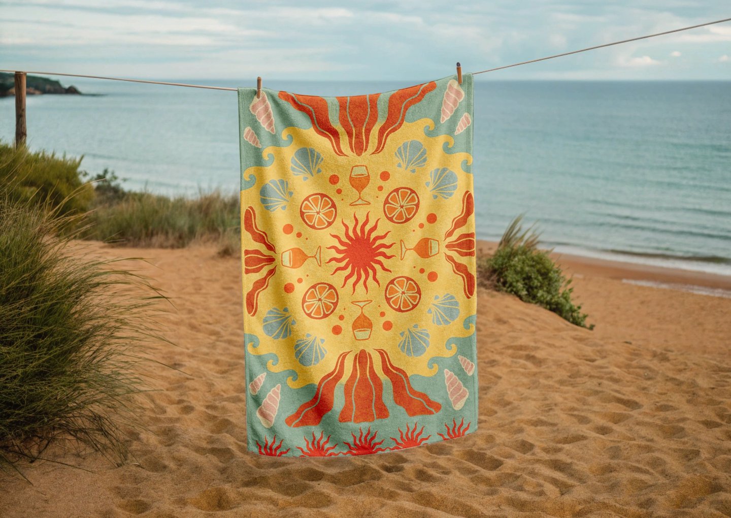
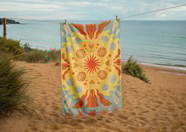
Solstice is a conceptual bath linen brand imagined by Les Briefs Créatifs. I was asked to design two beach towels based on their moodboard.
The overall art direction evoked Italy, sun, beach, and leisure — with yellow, orange, and blue as recurring color tones.
The brand values: sharing, modernity, expertise, and dynamism.
The challenge: I received the brief only two days before the deadline, so I had to find a way to speed up the design process while still respecting the creative direction.
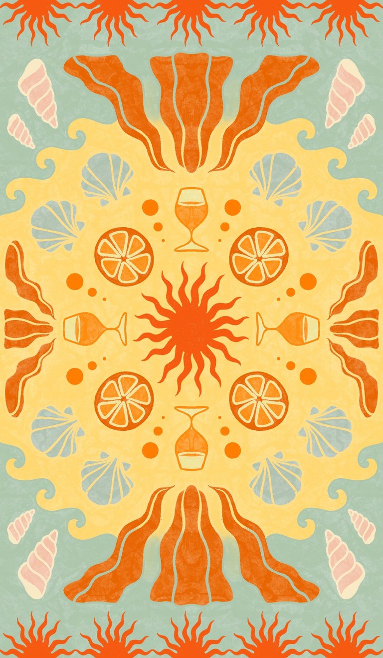
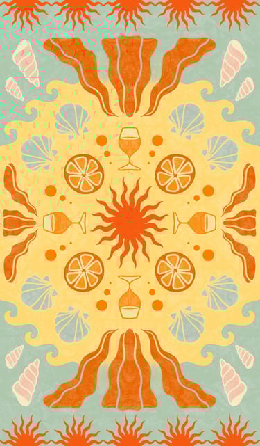
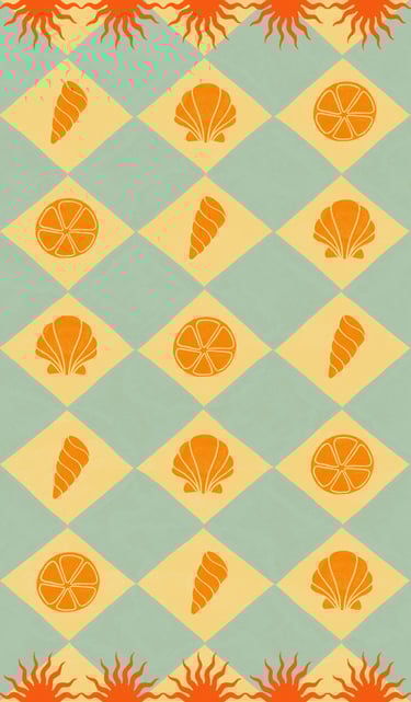
My concept: I drew inspiration from traditional Italian patterns, which often feature symmetry and repetition. I created a custom pattern using quadrilateral symmetry — by designing just one quarter of the layout, I was able to generate the full composition symmetrically, saving valuable time. I adapted the shapes and colors to give the result a more modern look. I also incorporated elements from the moodboard, such as cocktail glasses, citrus fruits, ’70s-style flowers, and other beach-related motifs.
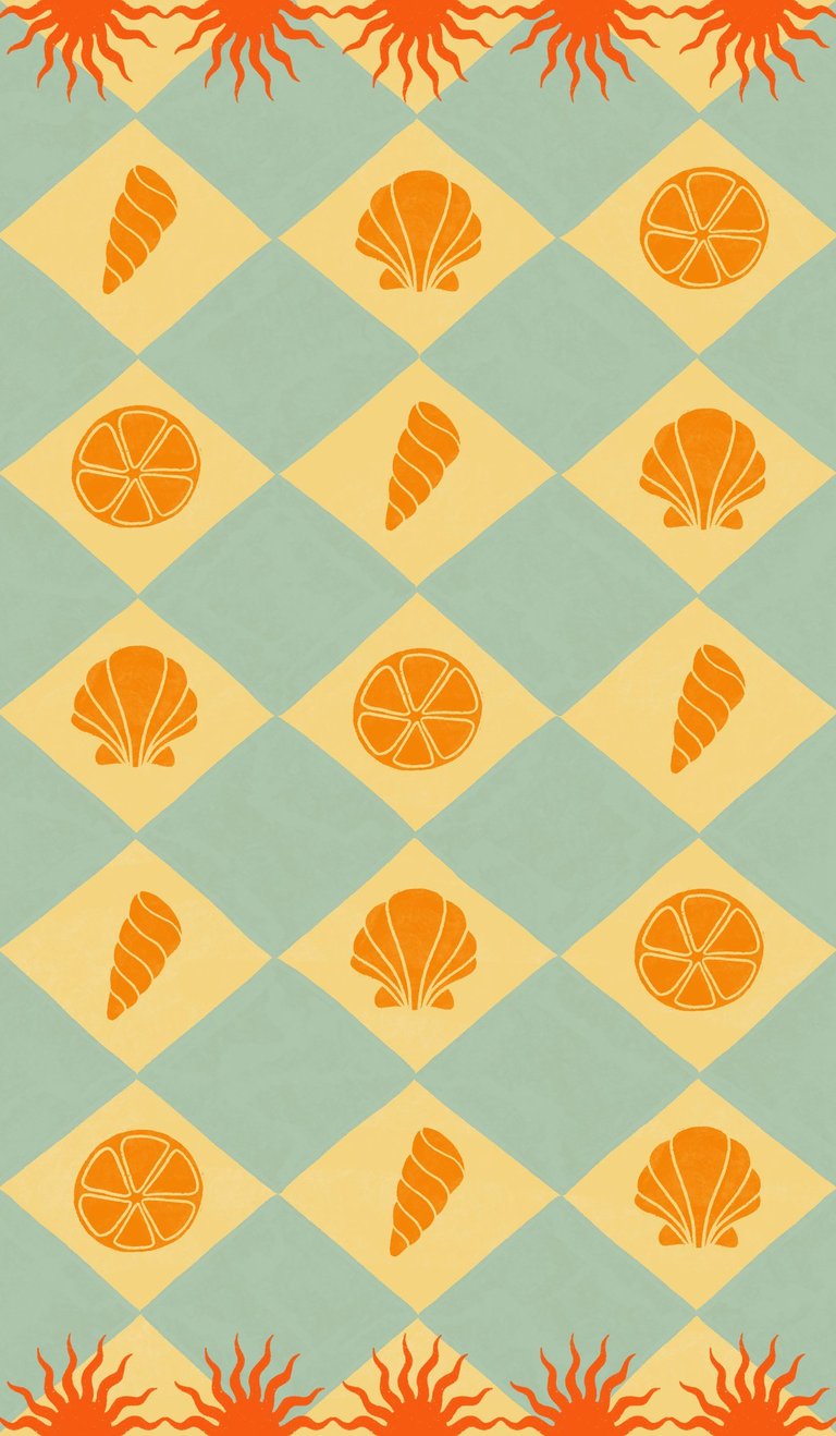
For the second towel, I used a checkered base — a motif deeply rooted in Italian (especially Sicilian) visual culture — and integrated the same elements from the first design to create a cohesive collection.
Final thoughts : This isn’t a universe I usually work with, so this brief led me to explore themes that were quite new to me. The result pleasantly surprised me, and I genuinely enjoyed developing it.